
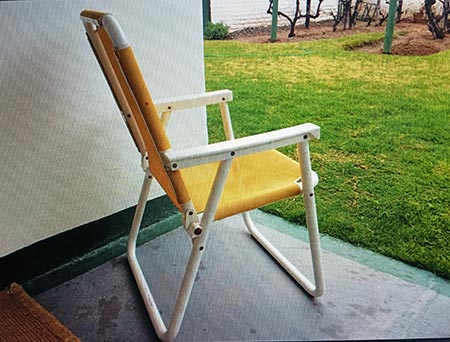
In order to use values to create a visually strong and compelling statement requires seeing and using them in their most reduced and simplified way. The chair above I painted on my ipad using a marquee tool and only three greys. A dark, middle and nearly white one.
Try this as a great exercise to understand values properly. The trick is, do not allow yourself any blending or mixing of your three values. By deciding to represent what you see in these simple tones, you have already made something that serves as a solid foundation and one that you can continue to build on with confidence. Whatever detail or brushwork you do afterwards, providing it maintains this initial grouping underneath, it is then assured to work.